Monday, November 2, 2015

The Horizontal Line

The Horizontal Line
I won't go into detail or elaborate on these paintings. I simply want to make a brief comment on the simplicity of the horizontal line and the direct association 'we' make to the horizon line of our world; land or water. Regardless of colors, values, or where the line falls on the picture plane it is hard to escape the connection. 

Years ago, I read "All you need is a horizontal line to make a landscape". I enjoy this thought so much because it is in understanding the core elements that help me decide how I want to embellish or proceed in my own art. 

I am flipping the images because it reiterates this point well. 


These are all pigmented wax on 8x8 cradled boards. Below is shown in a large format to reveal subtleties and texture.

Saturday, September 12, 2015

Summer 2015 Series

Here are the images of the finished Summer 2015 Series, an intuitive journey. I allowed for shapes and patterns to emerge and submerge, embracing the "not knowing". Aside from a dedicated color palette and the 10"x10" format there were no preconceived ideas. 

The summer of 2015 has been a wonderful summer for me. A huge transition from working full time to taking that leap of faith in myself and in my art to go deeper into the journey of exploration: a true sense of not knowing. It is interesting to me that this series is a reflection of me at this particular time in my life. 


#1 - Beach Revisited


#2 - Walkway


#3 - Pillars


#4 - Tangents


#5 - Ties


#6 - Me


#7 - Me, too


#8 - Cloud Quilt


#9 - Walking


#10 - Lighthouse

Sunday, August 23, 2015

Working in a Series

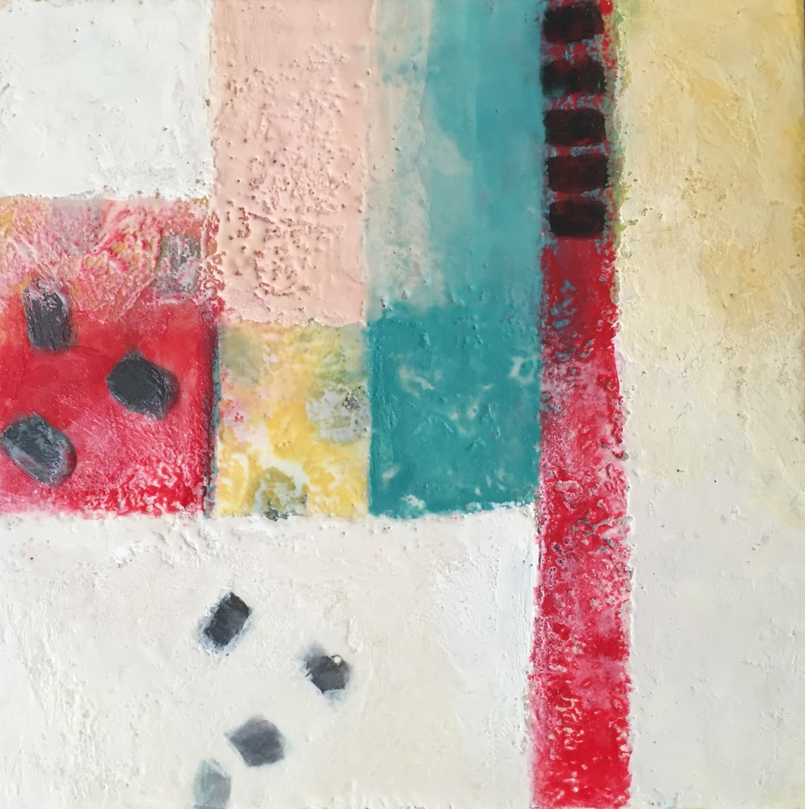
A few weeks ago I started several paintings at one time and decided to work them simultaneously as a group. Ultimately, I began working on them as individual paintings, while also wanting them to have a cohesive quality to the whole unit. This is not how I typically work at all. What prompted this approach for me was the idea that my work feels somewhat fragmented with a lot of different styles. I am not saying that I am dissatisfied with the variety, more that I wanted to explore the intentional making of a body of work. I enjoy seeing series that other artist develop, and some artist I know have been working a series for years. It is fascinating to see how one concept evolves and grows richer. 


I'm not done with these paintings quite yet. One thing I do know about my more recent art using the encaustic technique is that I am attracted to rectilinear quilt like compositions. I did not have a plan or idea of what I was going to create, only that I wanted to work with certain colors. Everything else has been very intuitive and letting one thing lead to the next. 


Starting out there are ten 10x10 panels
Most of the colors I am using are custom mixes using
Naphthol Red. Cobalt Aqua, Midtone Grey, Red Earth Pale,
enhanced Naples Yellow Hue and Titantium White
(all Enkaustikos encaustic paints)  

Layers and layers

This is were I lefts things for about a month.
I needed to get brave about taking them to the next level.  

I was overwhelmed with the business of them and felt the
need to start minimizing all the patterns.

I also love using white paint. 

It was with this one that I began to contemplate the white halos,
 they are  symbolic, but I don't want to over use it, ether. 

Then I realized I was in essence referring to the landscape
so I decided to begin suggesting it more boldly in some.
I also added another color to the mix, Anthraquinone Blue.
I actually think I am in love with that color. 

I really enjoy the quilt look to this and it actually
make me want to pull out my sewing machine.
I also added Cobalt Green Light, a color I would like to
paint my bedroom. 
So this one refers to the landscape and the little dark
patch represents the night sky. Here the white halos take
on more presence, like five figures. 

Thursday, June 26, 2014

My Palette

Okay, the idea is for me to take a look at the colors I tend to reach for most often. I think it is fairly obvious that I approach paint with the idea of color mixing. I also am intrigued with the way I interact with color in regards to the different mediums that I use. Coming from an oil painting background, then moving onto pastels, and now working mostly with encaustic, it is fascinating how I tend to use the same paint colors but in very different ways. In oils, I mixed on a palette, in pastels I created optical mixes and with encaustic I am enjoying using the paint as is. Sometimes I extend with medium, sometimes I don't. Sometimes I mix and sometimes I don't. What I find most interesting is that it really doesn't matter what medium I'm working in, I tend to go to the same colors and I believe that speaks to the uniqueness of the artist.  Here is a list of the pigments I have enjoyed working with in the various mediums, but most especially in encaustic. 


Alizarin Crimson 
PR83
Transparent
PIGMENT: Anthraquinone Aluminum Hydrate Alizarin Crimson is a deep transparent red much like a bordeaux with a warm undertone. Alizarin Crimson has a moderately strong tinting strength. While Alizarin Crimson leans to the bluer side on the color wheel, I enjoy the warm undertones are revealed when extended with medium. Alizarin Crimson does not have an excellent lightfast rating, so just be aware of that. 


Anthraquinone Blue
PB60
Transparent
Lightfastness: I
PIGMENT: Indanthrone
Anthraquinone Blue is a very dark, transparent blue pigment. It has a moderately strong tinting strength, yet is easily controlled when creating mixes. Also known as Indanthrone Blue, this blue is more commonly associated with an indigo. This blue is reminiscent of the night sky when extended with wax medium, maintaining lots of depth and richness as well.  Even though it has a slightly reddish cast it is equally suited to mixing deep purples as well as deep greens. When mixed with white it tends to grey out quickly to a "navy", and if bluish grey is what you are looking for, try mixing it with any of the umbers. It has completely different properties than the Phthalo Blues, Ultramarine or Prussian Blue.


Anthraquinone Orange

PO43
Semi-Transparent
Lightfastness: I
PIGMENT: Anthraquinone Orange
Anthraquinone Orange is a deep, cool, semi-transparent orange with a very high tinting strength. This pigment is an excellent addition to the palette where the desire is to mix vibrant transparent colors. Because of the transparent nature of this pigment, glazing is easily achieved. Mixing with other transparent colors such as Bismuth Yellow, Alizarin Crimson, and Quinacridone Red will result in extremely intense warm hues. Add a touch of white for instant cooling effects. Mixed with it’s compliment of Phthalo Blue Green Shade will result in the darkest chocolate tone, an optical black.


Bismuth Yellow
PY184
Semi-Transparent
Lightfastness: I
PIGMENT: Bismuth Vanadate Yellow
Bismuth Yellow is a very clean, vibrant yellow with a high tinting strength and it is semi-transparent. Bismuth Yellow is great for mixing because of its natural clarity. It is an alternative to Cadmium Yellow Light, which it is most similar. The difference being that Cadmium Yellow Light is opaque and Bismuth is slightly cooler and when used to mix with other transparent paints you will maintain translucency suitable for washes of color.


Cadmium Red Vermilion
PO20
Opaque
Lightfastness: I
PIGMENT: CP Cadmium Sulf-Selenide 
Cadmium Red Vermillion is an intense and vibrant orange-red. It is opaque and has a strong tinting strength. This same pigment is used in other art mediums and frequently referred to as Scarlet Red or Scarlet Vermillion. Cadmium Red Vermillion is a single pigment that fits naturally between Cadmium Orange and Cadmium Red Light. I love to use this paint especially when I am printing with encaustic paint. 


Cadmium Yellow Deep
PY35
Opaque
Lightfastness: I
PIGMENT: CP Cadmium Sulfide
Cadmium Yellow Deep like all other cadmiums is a dense pigment.  It is right on the cusp of being referred to as an orange. It has a strong tinting strength, but is mellow enough to use straight. It is an opaque pigment, even still, it can make a clean glaze where it tends more towards a yellow hue than orange.


Cobalt Green Light
PG50
Semi-Transparent
Lightfastness: I
PIGMENT: Cobalt Titinate Green Spinel
Cobalt Green Light is semi-transparent and has a low tinting strength. This is one of my all time favorites. A very mellow green that is perfect just the way it is, no need to alter this color in my book. This is a single pigment that is lighter than the Cobalt Green, in other words, no white added. It is also a slightly cooler green. I think green is one of the harder colors to mix and also to use with success in my own art and yet I am so attracted to it as a hue. Cobalt Green Light is soft and not high key at all so when I paint with it in encaustic I use it straight. 


Graphite
PBK10
Opaque
Lightfastness: I
Pigment: Graphite 
Graphite in encaustic paint is the perfect choice for printmaking. It is very dense, deep grey-black and has a slight sheen that gives it a velvet like effect. I have experimented with mixing it with other pigments and can say that the best results for me were when I mixed with the high tinting strength transparent pigments such as the Phthalos and Quinacridones. 


Indian Yellow
PY110
Semi-Transparent
Lightfastness: I
PIGMENT: Isoindolinone
There are several pigments that get the common name Indian Yellow. The pigment I really like is PY110. It is a semi-transparent pigment that has a vibrant orange mass tone, when extended with medium it yields a truly unique, glowing and vibrant yellow undertone. Even though it is semi-transparent, it has a very high tinting strength. I never use paint made from this pigment full strength since the undertones are what is so special about it. 


Phthalo Blue Green Shade
PB15:4
Transparent
Lightfastness: I
PIGMENT: Copper Phthalocyanine
All Phthalo pigments have and extremely high tinting strength. In mass tone they are extremely dark in value, often overlooked on the shelf since they appear black. They are also transparent in nature. Therefore, they are an excellent choice for extending with medium for glazing. When used for mixing other colors, only a small amount is needed.  Phthalo Blue Green Shade makes a stunning turquoise blue when mixed with either Zinc White or Titanium White. I tend to use this color a lot encaustic printmaking. 


Titanium White
PW6
Opaque
Lightfastness: I
PIGMENT: Titanium Dioxide Rutile
Titanium White is a brilliant, opaque white. It also has superior tinting strength, which means that it takes just little Titanium White to make a shift in color value when mixed with other paints. However, while Titanium White is an excellent choice for custom color mixes, it is also perfect for direct painting. Its excellent covering power makes it extremely useful. I really enjoy what I call a “blonde” palette, so for me have to be careful not to over use Titanium White.


Ultramarine Blue
PB29
Transparent
Lightfastness: I
PIGMENT: Complex Silicate of Sodium & Aluminum with Sulfur

Ultramarine Blue is a transparent deep blue with moderate tinting strength. It has reddish undertones. Ultramarine Blue is probably the most versatile blue and therefore a classic color for the palette. The word ultramarine means “over the sea.” In ancient times, ultramarine was made from lazuli otherwise known as the mineral lazurite. Obtaining ultramarine from lazurite was so costly that it has been artificially manufactured since the early 1800’s. One of these days, though I would like to paint with lazuli. It just sounds so exotic.
Naphthol


The red I tend to go to most often is Naphthol Red PR112. 

However, I am learning about Pyrrole Red PR254 now and I might have my new favorite. 

Both of these reds are high tinting and transparent. Naphthol is a little cooler than Pyrrole, both are vibrant and great for color mixing. It’s not that I have to decide, but I really enjoy knowing what I can expect out of a color so I tend to work with a limited palette till I am really confident with the personality of a specific pigment. 

Monday, June 16, 2014

In Finding My Voice with Encaustic


One of the hats I wear at Enkaustikos, where I work, is the demo artist hat. I like demonstrating the encaustic medium and explaining to people the various ways in which you can work with it. I like teaching and sharing what I know.  Usually, in a demonstration I will start with the basic set up and introduce the fundamental principles of applying encaustic paint. As the questions come from the audience, I demonstrate a technique that supports the answer, and then another question, and then another demonstration, and so on.  

Next thing you know, I have what I would call a story board. I have lots of story boards and each one has a certain something about them that is both planned and yet random. 

I find that I am really attracted to the story board, they are sort of quilt like, which is very appealing to me, same with old game boards or anything that has a strong pattern that is softened in some way. I like the structure and the organic nature, simultaneously. 

I tend to run my workshops in the same way, where I start with a demonstration and as the workshop evolves I demonstrate another technique, usually on the same piece. When the workshop is over, I will sit down to my palette and put the finishing touches on that story board. 

There are times when I come to my palette and I really don’t know where to begin. In ways, it is hard to know what my art might look like if I weren’t demonstrating or teaching workshops. I am reminded of the way I used to study for tests when I was growing up. I would stand in front of my chalk board, and I became the teacher explaining to the imaginary class before me how to solve the math problem, or what the sequence of historical events were. It helped me learn, and maybe in that same way, it is the way in which I am finding my voice with encaustic. 


Here are some more recent story boards I’d like to share. 

Sampler Series #6

Sampler Series #3

Latin Series #2


Map Series #2

Tuesday, May 27, 2014

My new website and being published

I invite you to take a look at my new website and help me celebrate in being included in the new publication Encaustic Revelations by Patricia Baldwin Seggebruch. There are many topics discussed in this book and my contribution focuses on keeping your palette simple for control on color mixing and creating a cohesive color palette, and on the use of Hot Tools by Enkaustikos.
It is exciting to be a part of the ever growing interest in encaustic. Stay tuned for my next posting where I will discuss my approach to working with this fascinating medium.


Sunday, April 27, 2014

The Value of Repetition

For reasons I will contemplate on later, and maybe it was just my nature at the time, I was never known to sketch out a scene or plan a painting. Even further from my nature was to paint the same thing twice, let alone three or four times. 

Consequently, I learned on the first and final piece, and in all it’s glory, my struggle was clear and evident. Dull, overworked and muddy washes next to clear vibrant passages, areas wiped and repainted several times not relating to areas I refused to retouch because something magical had happened. I was never quite sure how the magic happened, how I had achieved that one stroke of genius, and knew with utmost certainty I was not going to have that happy accident again. 

In art school, my instructors would encourage a few sketches to “work out” my composition. That was painful. I didn’t like the look of the marks I made, they certainly didn’t inform me the way I thought they should.  Even after I got practiced at the sketch, I didn’t seem to translate it well. Sort of like the reading of a book and then watching the movie. Pencil to paint were too different for me to bridge. I just wanted to paint, or more to the point, wanted to paint better than I was. Fixed on the goal and not the process. 

I’m fortunate to have had tremendous teachers in my life, and I suppose there is always that one teacher that actually makes you stand in your own shoes. For me, I’ve been fortunate to have had a few, but for the sake of this story I want to bring up a day in Peter Zallinger’s portrait class. I was starting to feel a little competent with the portrait I was painting at the time, when Peter came to me and remarked that my portrait was coming along really well. That felt amazing. Then, he said in a matter of fact way, “too bad the ear is in the wrong place”. To that I inquired in horror, what am I to do?  Wipe it off and paint it where it belongs, was his once again, matter of fact reply. 

I know I’m sounding juvenile right now, but I honestly didn’t think I could repaint that ear as well as I had done the first time, let alone move the whole thing on what at this point was what I considered close to being a finished painting. Actually, I was lacking confidence that the happy accident would happen again, but I did wipe it off, and I painted it again. Unfortunately, in the same place, so I had to repaint it a third time. What I learned from that experience was way more than how to repaint an ear or anything else for that matter. I learned the importance and the benefits of repeating something over and over again until I have a solid understanding of what it is I am repeating, because in that repetition, I am learning what is most important. I am learning the basics, the root, the fundamental core, muscle memory, and my own alphabet, the uniqueness of seeing through these eyes. 

As it turns out after years having passed, I can look at that painting and say all the areas where I thought I nailed it, are not so holy to me now. Really, all I see is the ear and the story behind it. Thank you Peter, for that gift. 


I have chosen these images for this journal entry because this is a place that I have painted many times and hope to paint many more. In it’s simplicity, there is so much to discover about the actual place, the materials I use, and about how I see things. Each time I paint this scene, a little more of that magic seems to show up. 

Pink Field
Pastel
The Grassy Field
Pastel


Linwood Meadow, Orange Field
Pastel